Learning Analytics · Attention & Comprehension

See where attention holds and where understanding breaks

Annoto's Analytics & Insights Dashboard turns watching behaviour and in-video responses into course, video and learner views, so you can act on the exact minutes that lose people while the term is still running.

Dashboard opens from inside Canvas, Moodle, Blackboard and Brightspace. Analytics are visible to instructors and moderators only.
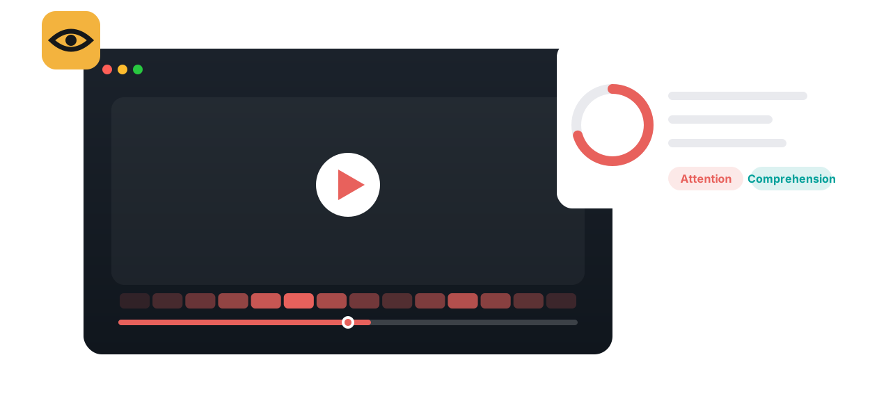

Annoto attention and comprehension analytics shown over a course video
Why it exists

A completed play tells you almost nothing

A view can be a background tab, a double-speed skim, or a learner who watched twice. The number looks identical.

Attention is watching behaviour

Coverage over time, how much is watched per play, seconds spent, and views taken.

Comprehension is what they produce

Quiz results, comments and replies, personal notes, and an engagement score.

Three levels of view

The whole course, a single video, and an individual learner.

A short recommended reading

Lowest completion rate, least active learner, busiest moment on the timeline.

Course, video, learnerSortable with tooltipsCSV export
What it looks like

The Video View, where attention and comprehension meet

Every video in a course gets its own view: a participation radial, the three consumption metrics, the Users Activity table and the Assessment tab, with the interactive timeline showing where the discussion concentrated.

Course · Biology 101
Hub
Video insights
Users Activity
Activity Trends
Assessment
Preferences
Time range · Sep 1 to Sep 30
Users participation (sample)
128
active
Engaged 84%
Collaborated 53%
Noted 41%
Video consumption (sample)
62%
Avg. completion rate · how much is watched per play
81%
Avg. total completion · coverage over time
118%
Avg. watch time · above 100% means rewatching
Interactive timeline · comments per moment (sample)
00:00
14:20 · 23 comments
41:05
Learner
Total completion
Views
Engagement
A
Amira
3
High
J
Jonas
2
Medium
P
Priya
7
Medium
M
Marco
1
Low · check in
Course View
Video View
User View
Overview
Videos table
Users Activity table
Activity Trends
Assessment tab
Interactive timeline
Time range
CSV export
Pedagogical value

Feedback for the teacher, while there is still time to use it

Attention and comprehension are different problems with different fixes, so the dashboard keeps them side by side.

A view count
A background tab counts as a view.
A double-speed skim counts exactly the same.
No way to tell watching from understanding.
With attention and comprehension
Coverage, watch time and repeat views per learner.
Quiz results, comments and notes set beside them.
You can see which of the two is actually failing.
Formative assessment & feedback timing

Act in week four, not after the exam

Annoto does

aggregates completion, watch time, views and interaction results per course, per video and per learner, within the time range you choose.

The learner

watches, answers in-video questions, comments and takes notes as part of normal viewing; nothing extra is required of them.

The instructor sees

which videos and which minutes lose the cohort, in time to add a prompt, re-explain, or re-record before the next session.

Active vs passive viewing

Views are not engagement

Annoto does

keeps views and engagement separate: a view is the first play in a session; engagement scores what learners create and consume, and play or pause do not count.

The learner

earns engagement by commenting, replying, writing notes, reading replies, clicking time-tags and reacting.

The instructor sees

a participation radial of active, engaged, collaborated and noted users, and a table that ranks learners on each.

Cognitive load & segmenting

Find the minute that overloads the video

Annoto does

reports average completion rate as a dropout signal and shows on the interactive timeline where comments pile up.

The learner

leaves, rewatches or asks at the exact moment the explanation outran them.

The instructor sees

a low completion rate on one video and a tall bar at one timestamp, which together point to the segment to shorten, split or scaffold.

Metacognition & self-regulation

A learner's own trend line

Annoto does

gives each learner My Space stats and gives instructors a User View with a completion funnel and an Activity Trends graph over the term.

The learner

sees how many notes and comments they have added across the course and can adjust their own habits.

The instructor sees

when a learner's activity changed, such as before an exam or during a break, and can reach out with a specific observation rather than a general warning.

Capabilities

The metrics behind the two questions

Average completion rate

The share of a video watched per play, averaged across views. It is the dropout metric: a low number means learners leave part-way through each time they press play.

Total completion and watch time

Total completion is coverage over time; watch time is every second spent, shown as a percentage. Together with completion rate they form the consumption triangle, and an uneven triangle is the cue to look closer.

Participation radial

For a course or a video, the share of users who were active, engaged, collaborated with a comment or reply, or wrote at least one personal note.

Engagement score

A score for creating and consuming user-generated content: comments, replies, notes, reading replies, clicking time-tags, likes. Playing and pausing the video do not count.

Users Activity table

Per learner: last activity, total completion, average completion rate, watch time, views, engagement, collaboration and replies. Sort any column to find the most active learners or the ones who need a check-in.

User View

One learner across the whole course: a completion funnel from views to watched videos, their consumption triangle, activity metrics and an activity trend over time.

Activity Trends

A course or learner timeline of comments, replies, notes and engagement. Toggle metrics, zoom into a week, and download the graph as CSV, SVG or PNG.

Assessment tab

The comprehension side. For each video: highest, mean and lowest grade, a completion graph for the activity, and a quiz results table per learner with their final grade, completed interactions, correct attempts and every answer.

Use cases

Where the two signals change what happens next

Large lecture course

Fix the lecture, not the students

Sort the Videos table by average completion rate. The recording at the bottom is the one learners abandon each time they press play. Open its Video View, find the tallest bar on the interactive timeline and the most-missed quiz question in the Assessment tab, and you have the segment to re-record or to precede with a reflection point next term.

Flipped classroom & seminar

Know who prepared before the room fills

Set the time range to the days before class and sort the Users Activity table by total completion. Learners who covered the video and answered the question walk into a discussion; learners who did not can be paired deliberately. Over a term, the Activity Trends graph shows whether preparation holds up after the novelty fades.

Skills & demonstration courses

Rewatch bands mark the hard steps

In a procedure video, watch time far above one hundred percent on one learner and one segment means the step was replayed many times. That is the step worth slowing down in the demonstration, adding a comment to, or breaking into its own short clip.

Corporate learning & onboarding

Completion you can stand behind

Compliance and onboarding programmes need more than a checkbox. Total completion shows how much of each module was actually covered, the participation radial shows who engaged rather than just played, and the CSV export gives L&D a record per employee and per cohort without a manual tally.

How it works

From first play to first decision in three steps

1

Turn analytics on

Enable the Analytics & Insights Dashboard in course preferences. It is visible to instructors and moderators only, and it opens from the course menu or from any video inside the LMS.

2

Learners watch and respond

Every viewing session records coverage, completion per play and seconds watched. Every comment, reply, note, reaction and quiz answer records engagement and, in the Assessment tab, understanding.

3

Read course, video, learner

Start in the Course View, sort the Videos table to find the outlier, open its Video View, then click a row in Users Activity to open a learner. Set a time range, export CSV when you need the data elsewhere.

A useful weekly routine takes ten minutes: one video with the lowest completion rate, one timestamp with the most comments, one learner with the lowest activity. Decide one action for each and move on. The dashboard is built to make that loop fast rather than to reward hours of exploration.

Insights

What the dashboard produces, and how to read it quickly

At course level: a participation radial, active videos, average completion rate, and the totals for views, engagement, collaboration, interactions and notes, plus the Videos and Users tables and an Activity Trends graph. At video level: the same participation view, the consumption triangle, the Users Activity table, the discussion with unread comments highlighted, and the Assessment tab. At learner level: a completion funnel, their consumption metrics and their trend over the term.

Three reading habits cover most of it. A video with a low completion rate but high watch time is being replayed in pieces, not abandoned; look for the segment. A learner with far more or far fewer views than the rest may be struggling; open their User View and check completion rate against total completion. Tall bars on the interactive timeline mark either a lively exchange or a shared confusion, and the comments underneath tell you which.

Every figure below is a sample. The real ones arrive with tooltips explaining the calculation, a time-range control per tab, and a CSV export for the course.

Course overview · Attention & comprehension
Sample data
84%
Engaged users (Sample)
62%
Avg. completion rate (Sample)
73%
Mean quiz grade, Lecture 9 (Sample)
Avg. completion rate per video (Sample)
Lecture 3 · Membranes
88%
Lecture 7 · Enzymes
71%
Lecture 9 · Kinetics
44%
Lab briefing 4
29%
Attention across Lecture 9 (Sample)
00:00
rewatched 14:20
drop-off 31:10
41:05
In your LMS, with Lumo AI

Insights where the course already lives

The dashboard opens from the course menu or from a video inside Canvas, Moodle, Blackboard and Brightspace. Quiz scores reach the LMS gradebook through grade passback, exports leave as CSV, and Lumo Copilot adds a layer of interpretation on top.

LMS access

One click from the course

Instructors reach the Course View from the LMS course menu and the Video View from the video itself, without a separate login. Preferences decide who sees analytics; learners never do.

Grades & export

Comprehension that reaches the gradebook

In-video quiz results pass back to the LMS gradebook automatically, and the course export bundles overview and per-user CSVs for grading, participation credit or institutional reporting.

Lumo Copilot

Where learners get stuck, by level

With Lumo-designed interactions built around Bloom's taxonomy, educators can see where learners are stuck at each level, from remembering to creating, adding a comprehension lens to the watching data.

In their words

“In an online class, Annoto accomplishes many of the same goals for discussion as an in-person class. I highly recommend it to other instructors!”

Dr. Cindy Wilson, Florida State University
Dr. Cindy Wilson
Course Instructor · Florida State University
Read the case study →
FAQ

Attention & Comprehension, answered

What does Annoto mean by attention?
Watching behaviour, measured per session and aggregated: views, total completion (how much of a video was covered over time), average completion rate (how much is watched each time it is played) and watch time (seconds watched, shown as a percentage). Together they show whether learners finish a video, watch it in short pieces, or replay the same segments.
How is comprehension measured?
Through what learners produce rather than how long they watch. The Assessment tab in the Video View reports graded interactions such as in-video quizzes: the highest, mean and lowest grade, how many participants completed the activity, and a per-learner results table that opens into each learner's answers. Comments, replies, notes and the engagement score add context, and the interactive timeline shows where questions cluster.
What is the difference between average completion rate and total completion?
Average completion rate is the sum of the percentage watched in each viewing session divided by the number of views: it describes dropout per play. Total completion is the aggregated coverage across all sessions: it describes how much of the video a learner eventually watched. A low completion rate with high total completion means the video is watched in many short sittings.
How is engagement scored?
Engagement is a score for creating and consuming user-generated content. Actions such as writing a comment or reply, adding a personal note, reading a reply, clicking a time-tag and liking all contribute. Playing and pausing the video do not count, which is why views and engagement can tell different stories.
How do I spot at-risk learners?
Sort the Users Activity table by views, total completion or engagement. Extremely low activity may indicate an at-risk learner, and a learner with a radically different number of views from the rest may be struggling. Click the row to open the User View, where the completion funnel and Activity Trends graph show how their participation changed over the term.
Who can see the analytics?
Instructors and moderators only. Analytics are enabled in course preferences and are never shown to learners. Learners see their own comment and note counts in My Space, not the dashboard.
Can I export the data?
Yes. Course analytics export as a zip of CSV files, including an overview and per-user activity. The Activity Trends graph downloads as CSV, SVG or PNG, and a video's comments export as a spreadsheet or document with their time-tags.
Can I look at a specific period?
Yes. Each insights tab has a date-range control, so you can look at the week before an exam, a single module, or the whole term, and compare periods by changing the range.
Keep exploring

Related features and journeys

Learning Analytics

See attention and comprehension on your own course video

Book a short demo and walk through the Course, Video and User views inside your LMS, on your content.